
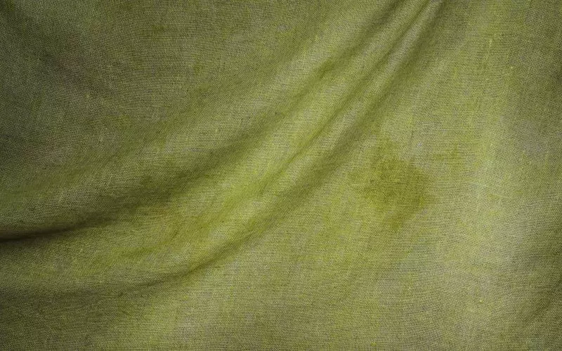
You can now set a background texture on any template: paper, linen, concrete, fine grain, and a handful of others. It sits behind your content and changes nothing about the layout.
Why texture rather than a color or a photograph
A flat white background is fine and it is also what everybody has. A colored one is a strong commitment that goes wrong easily. A photographic background makes text hard to read and doubles the weight of the page.
Texture is the middle option. It gives a page a physical quality, it costs almost nothing to load because the tiles are tiny and repeat, and it is almost impossible to make text illegible with it.
Restraint, again
The whole point of these is that they are barely noticeable. If a visitor consciously registers your background texture, it is too strong. Every texture in the set is deliberately quiet, and the opacity control goes down rather than up.
The failure mode is picking one that looks nice at full size on a large monitor. Check it on a phone before committing, where the same tile repeats far more often and can start to look like a pattern rather than a surface.
What suits what
- Paper and linen suit theater actors, classical work and anything with a period feel.
- Concrete and fine grain suit contemporary screen work.
- None suits Modernist, which is designed around empty space and does not want anything in it.
Dark backgrounds
Several textures come in a dark variant. A dark site can look excellent and it has one specific trap: photographs shot against white backgrounds, which is most headshots, appear as bright rectangles floating in the dark. If your gallery is white-background headshots, stay light.
Performance
Each tile is a few kilobytes and repeats, so a texture adds essentially nothing to page weight. This is deliberately unlike a full-screen background photograph, which is the thing people usually reach for and which routinely adds half a megabyte to every page.
Related
The other appearance controls: color schemes, font choices, layout width and grayscale mode. Older reading: creating a professional look.
Create your free actor website and try one at low opacity.
Finished reading? Build yours next.
It takes about 76 seconds and it starts free, with your credits, headshots and reels already in it.
Build mine free→