
A resume on paper is one page with everything squeezed onto it. A resume on a website is a set of sections, each of which can be as long as it needs to be, and each of which a design can place where it makes sense.
You open a page, start reading, go to tap a link, and everything moves down the screen a fraction of a second before your finger lands. You tap the wrong thing.

The navigation on your website is built from the pages in your account. Add a page and it appears. Rename it and the label changes. Reorder it and the menu follows.
When a page uses a downloaded font, the text is painted first in whatever font is already on the device, then repainted when the real one arrives.
Two related improvements. Stylesheets are considerably smaller, and a change you make in your design settings shows up immediately rather than whenever your browser decides to look again.
Every design in the catalog carries its own stylesheet, and what reaches a visitor is not the file a theme author wrote.

Premium designs now offer a sticky menu: it stays at the top of the window as the visitor scrolls, instead of disappearing after the first screen.

There is now a custom stylesheet box in your design settings. What you write there is applied to your site after everything else, so it can override any rule in the design.

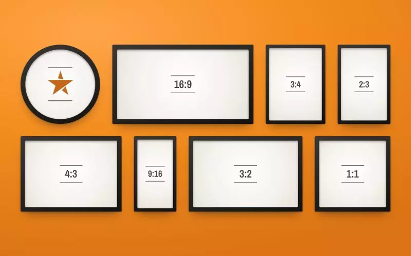
Every design now offers three content widths: full, which uses the whole window, contained, which is the traditional centered column, and narrow, which is tighter still.
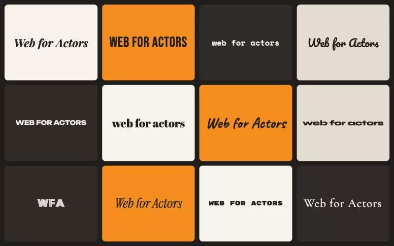
There is now a font setting on every design: a curated set of pairings, each one a heading face and a body face that are known to work together.
Every design now takes two colors from you: an accent and a background. They flow through links, buttons, headings, your email signature and your business card.

You can now set a background texture on any template: paper, linen, concrete, fine grain, and a handful of others. It sits behind your content and changes nothing about the layout.